Red + green = yellow
When the lights overlap on the same surface, the result tends toward yellow. As the power ratio changes, a yellow, orange, or greenish intermediate shade may form.
From colored gel filters to RGB LEDs, and from complementary color palettes to UV fluorescence—a comprehensive guide to using the color of light not just as decoration, but as a tool for exposure, contrast, and storytelling.

Hello, I'm Burak Bulut Yıldırım, a photographer and photography instructor. Are you ready to explore the magical world of colors together? Accompanied by the colorful photos I’ve taken over the past 20 years, you’ll find all the details of the techniques I demonstrated in my Reels video in this guide.
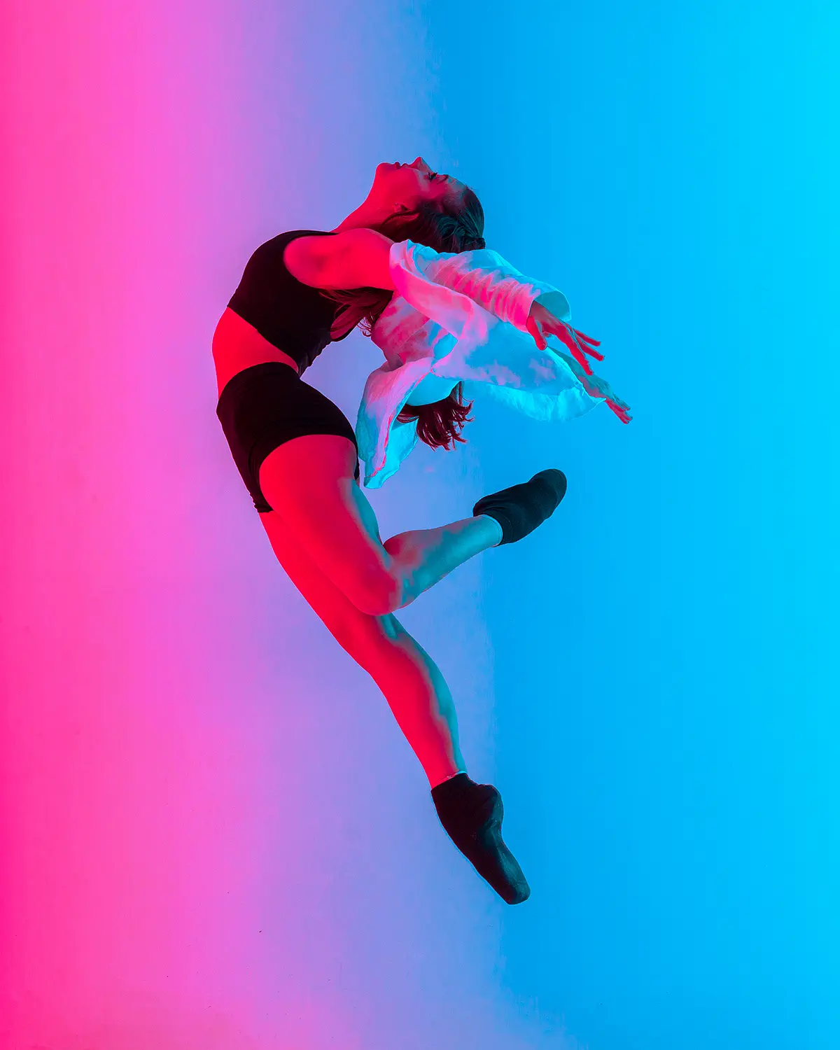
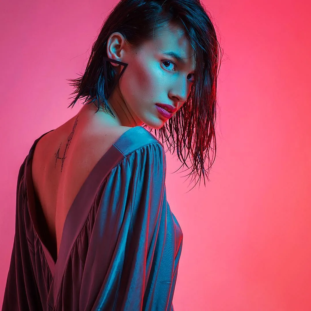
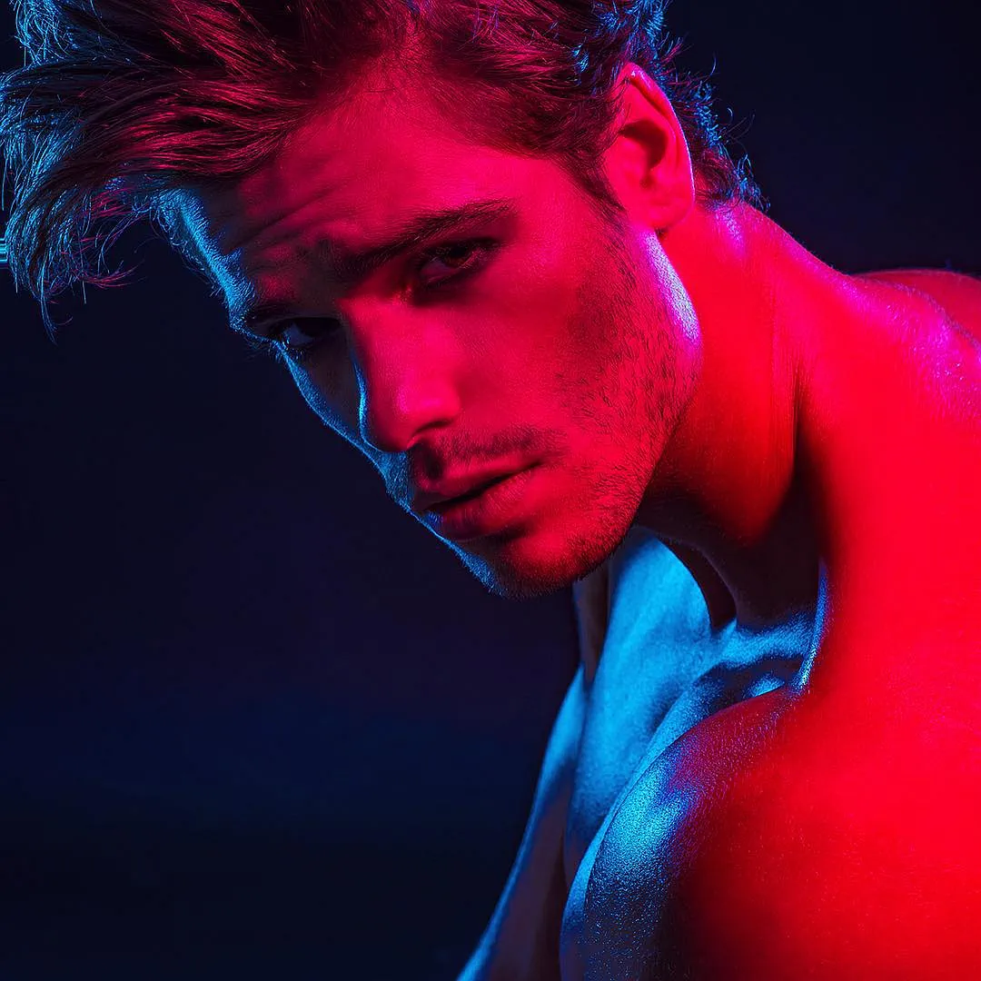
Colored light determines how skin texture is rendered, where metal surfaces stand out, how deep the background appears, and where the viewer’s gaze will land first within the frame. Therefore, achieving a good result involves much more than simply “choosing two colors.”.
In this guide, I first discuss the behavior of gel and RGB lights, followed by color theory and UV/black-light photography. The portrait, fashion, product, industrial, and UV photography selections are drawn from my own work; the equipment product images and technical diagrams are provided solely as references to illustrate the tools used.
If this is your first time, follow steps 01–03. The sections on color theory and UV continue in the second HTML block.
The color mixing in paint is not the same as the color mixing of light. In photography, we work with the RGB additive color system.
When the lights overlap on the same surface, the result tends toward yellow. As the power ratio changes, a yellow, orange, or greenish intermediate shade may form.
The magenta/purple family of colors forms in the overlapping area. If you want to keep the colors separate, physically separate the areas illuminated by the lights.
The total approaches cyan. When the three channels (K+Y+M) are superimposed in a balanced manner, a total close to white light is produced.
It transmits certain wavelengths of white light while absorbing others to a large extent. This process results in light loss and heat generation; the spectral transmittance curve in the technical data sheet is just as important as the filter’s color.
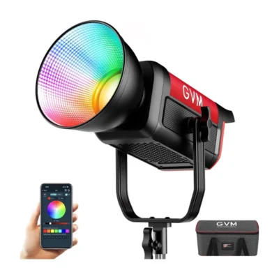
It electronically mixes different LED channels. Additional in RGBW true white (W) LED ...is present; this means true white that doesn't have a blue cast and a more natural skin tone. If your light has a "W" in its name, you're in luck—but be sure to test the white balance with your own camera.
At home, you can start with a powerful flashlight; on a professional set, however, power, color consistency, shaping, and heat management are the key factors.
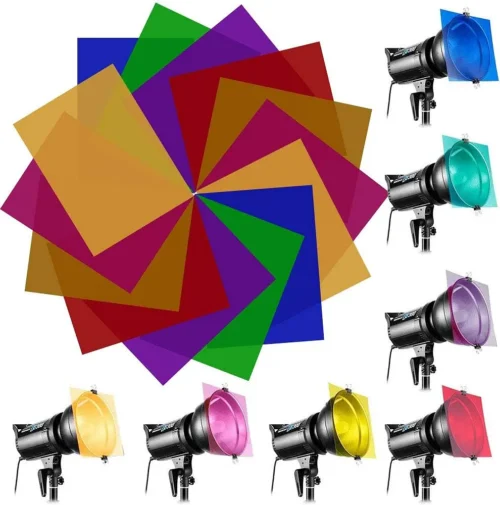
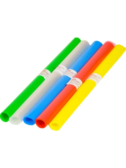
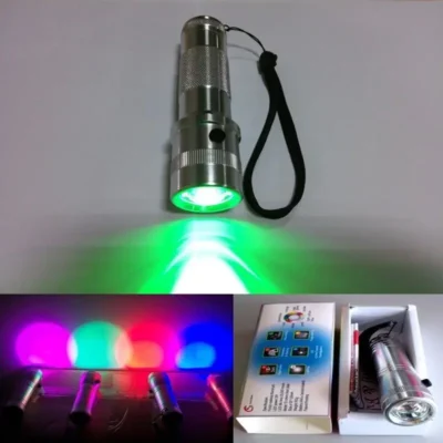
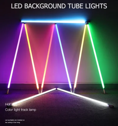

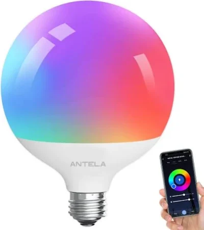
Heat-resistant gel: LEE and Rosco — you can calculate the exposure balance without setting up a test shot by referring to the transmittance (%) and stop loss values listed in each gel’s catalog.
RGB / RGBW LED: GVM Pro, Aputure, Nanlite, Godox, Colbor, Neewer. For white light quality CRI/TLCI ≥ 95 Set your goals; controlling everything through the app offers great convenience.
Heat safety: Stationery cellophane should not be used in front of tungsten/halogen or high-temperature continuous light sources. Use a professional heat-resistant filter; maintain a distance and allow for air circulation between the filter and the light source; when testing with cellophane, punch a few small ventilation holes in it, and follow the manufacturer’s temperature instructions.
The most reliable way to transition from a monochrome portrait to a two-color separation is to first adjust the area where the light falls, and then adjust the color and intensity.
Set the camera to manual mode. For the first test shot, make sure the scene is nearly black with the colored lights turned off.
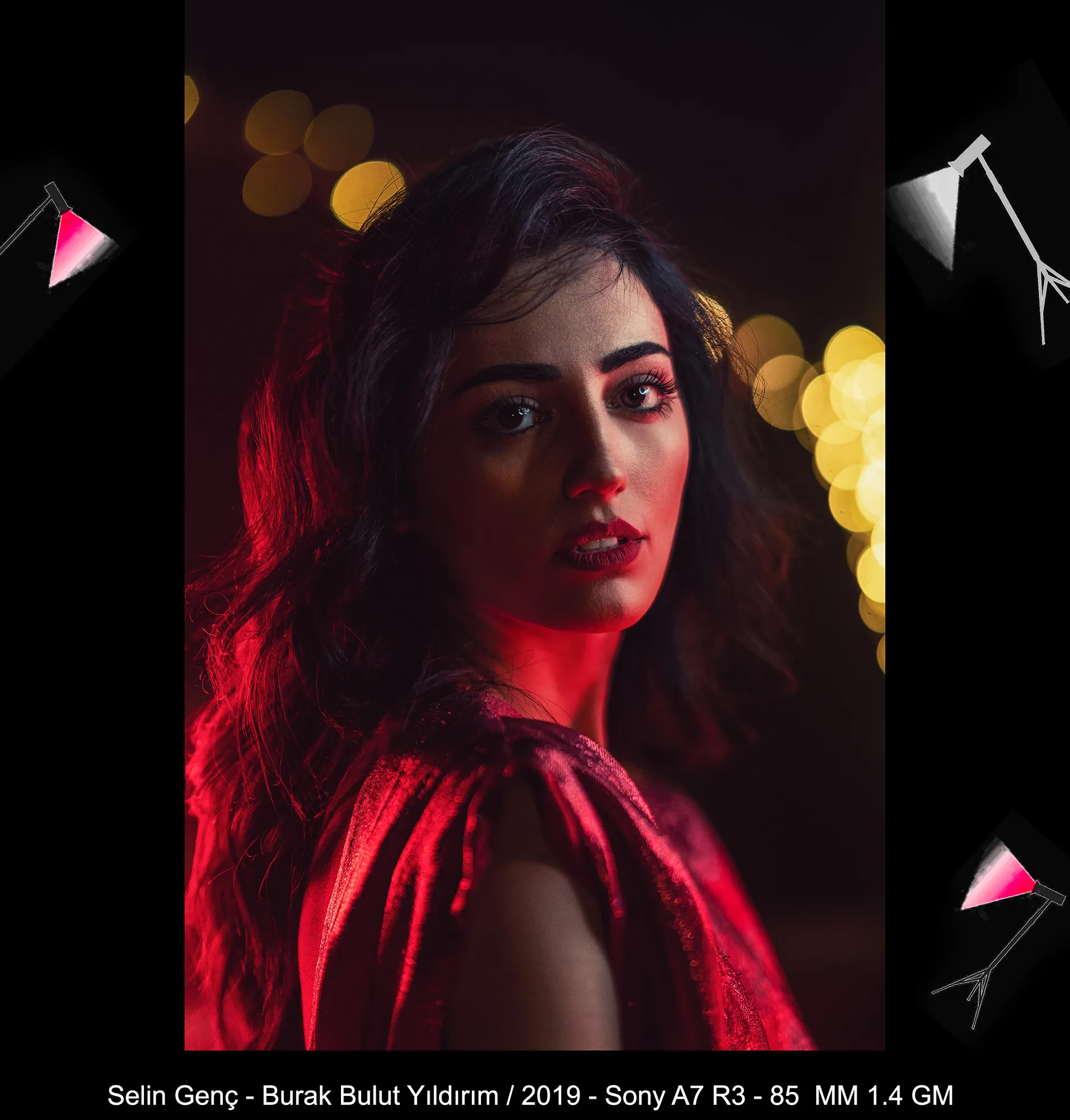
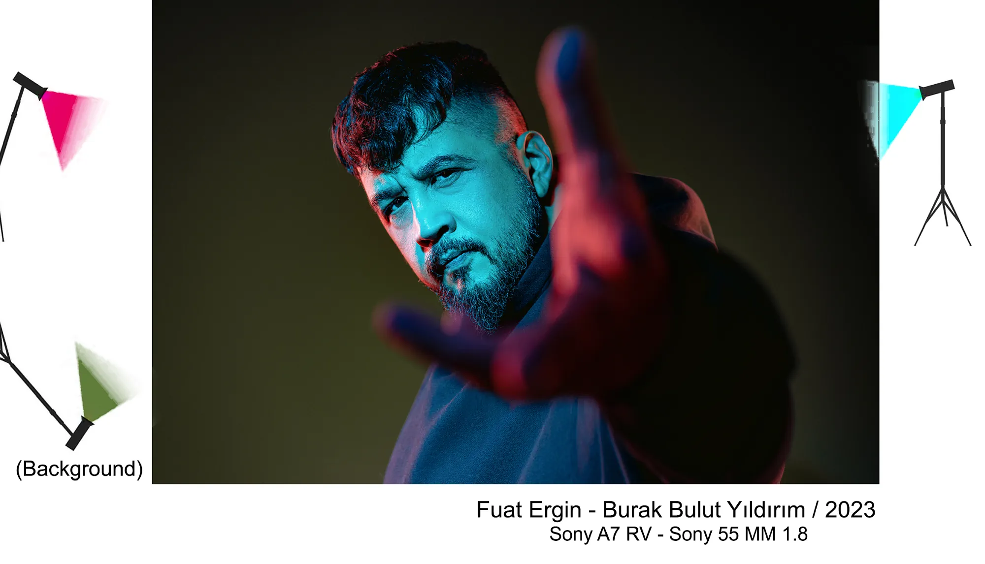
Position the first light at a 45° angle as the main light, and the second on the opposite side as a side or background light. Test each one separately. A single monochromatic color creates a sense of unity, while a contrasting color pair provides dramatic contrast.
Turn on both lights; check that no single channel is clipped in the RGB histogram. Adjust the brightness first, then the hue and saturation.
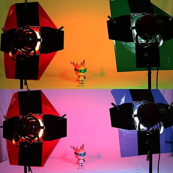
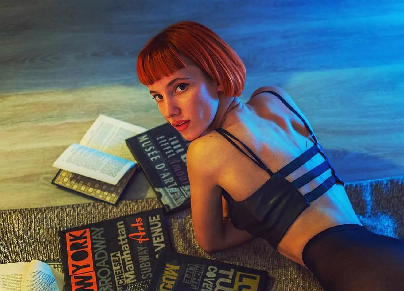
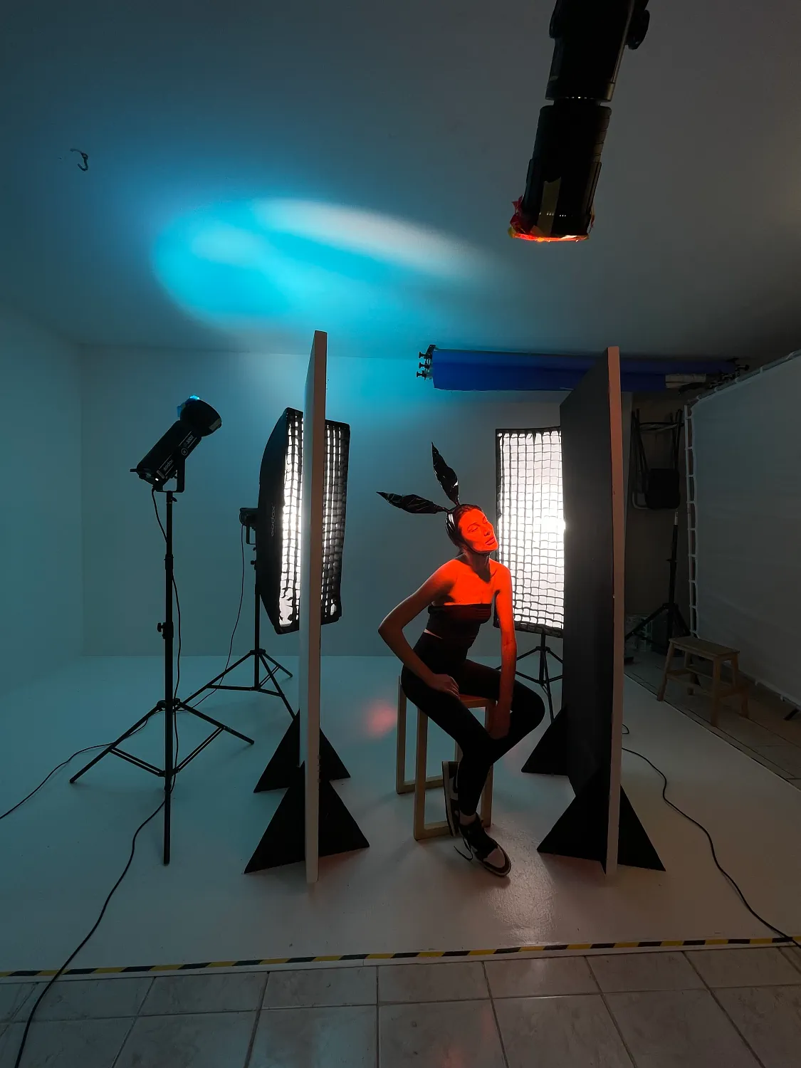
Look at what happened in this image: even though red was applied on one side and green on the other, the background and mascot turned out orange. Orange gel wasn’t used—it’s a light-diffusing material; when you aim red and green at the same point, the two colors add together. By the same logic, the area where red and blue overlap approaches magenta/purple. This isn’t a glitch; it’s additive color mixing.
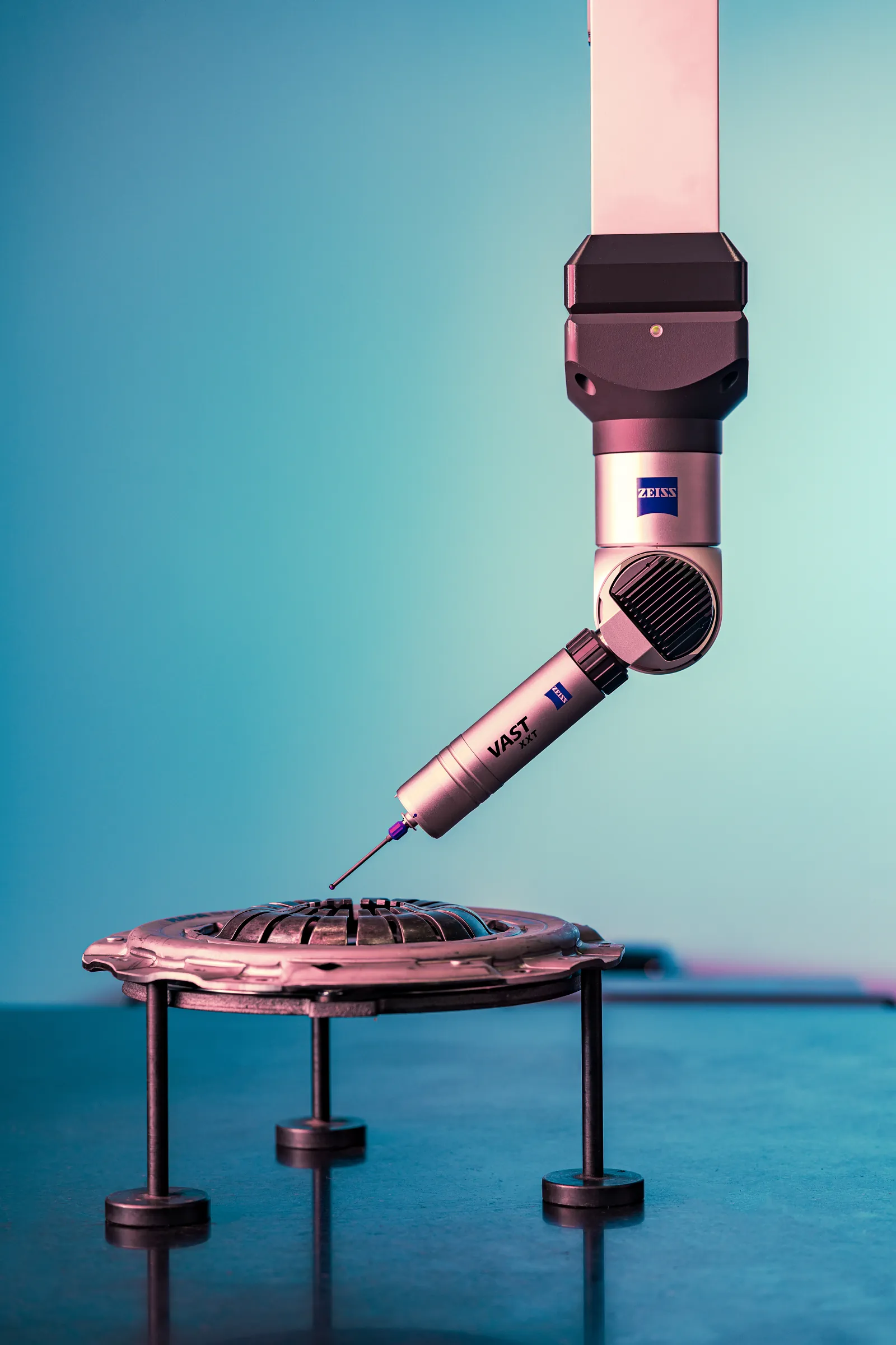
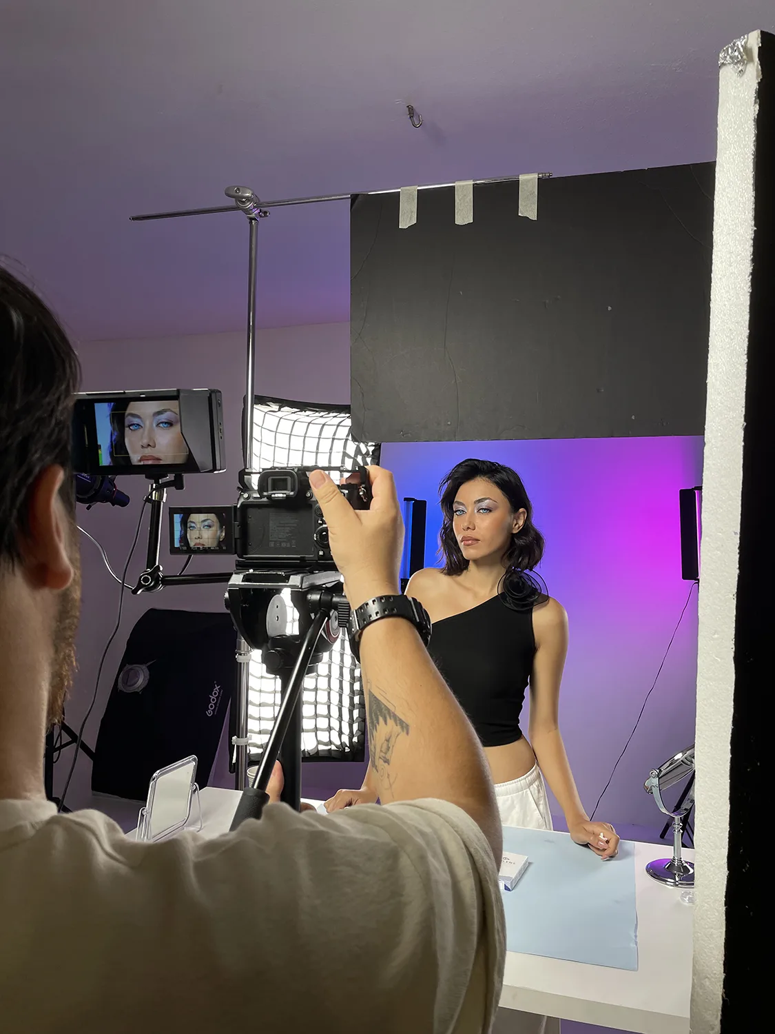
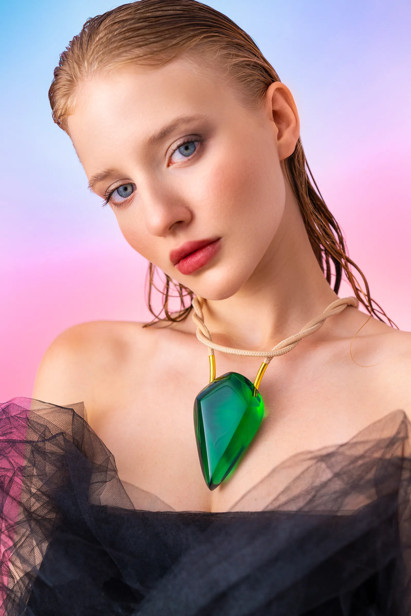
In this shot I took in 2021 for a natural stone jewelry brand, I directed the blue and red lights at an angle toward the background rather than directly at the product. By leaving the area where the lights overlapped in the background, I achieved a soft color transition.
Practical method: First, choose the transition point you want between the two colors; then adjust the width of the gradient using the light distance and power ratio. The key is to balance the power between the two lights.
RGB light transition, pulse, and color-changing effect modes with a long exposure By combining them, you can also create moving trails of color.
When working with colored gelatin in the studio, we come across an interesting fact of physics: when you attach blue gelatin to one of two flashes of equal intensity and red gelatin to the other, The blue side always turns out paler. Two reasons overlap:
1) Difference in permeability. High-saturation blue gels transmit a narrow band of the spectrum; for example, a medium-saturation blue gel transmits approximately of the light, while a red gel of similar saturation may transmit –75 of it. The exact value is listed in the transmittance row of the gel catalog and varies by brand.
2) Wavelength sensitivity. Our perception of brightness and the image processed by the camera peak around ~555 nm (green); at ~450 nm (blue) and ~640 nm (red), the brightness per watt is much lower. For those interested in delving deeper wavelength of colors and quantum efficiency of cameras can look at these topics.
Therefore, for a balanced shot, use a blue gel on the flash; depending on the gel’s tint, adjust the red by approximately 2–2.5 times more powerful (+1 to +1.3 stops) Get started. I’ve been explaining this to hundreds of photographers in my studio photography courses since 2010; now it’s not just Burak Bulut and my workshop friends who know this—you do, too. Can I count you among my workshop friends? ❤️
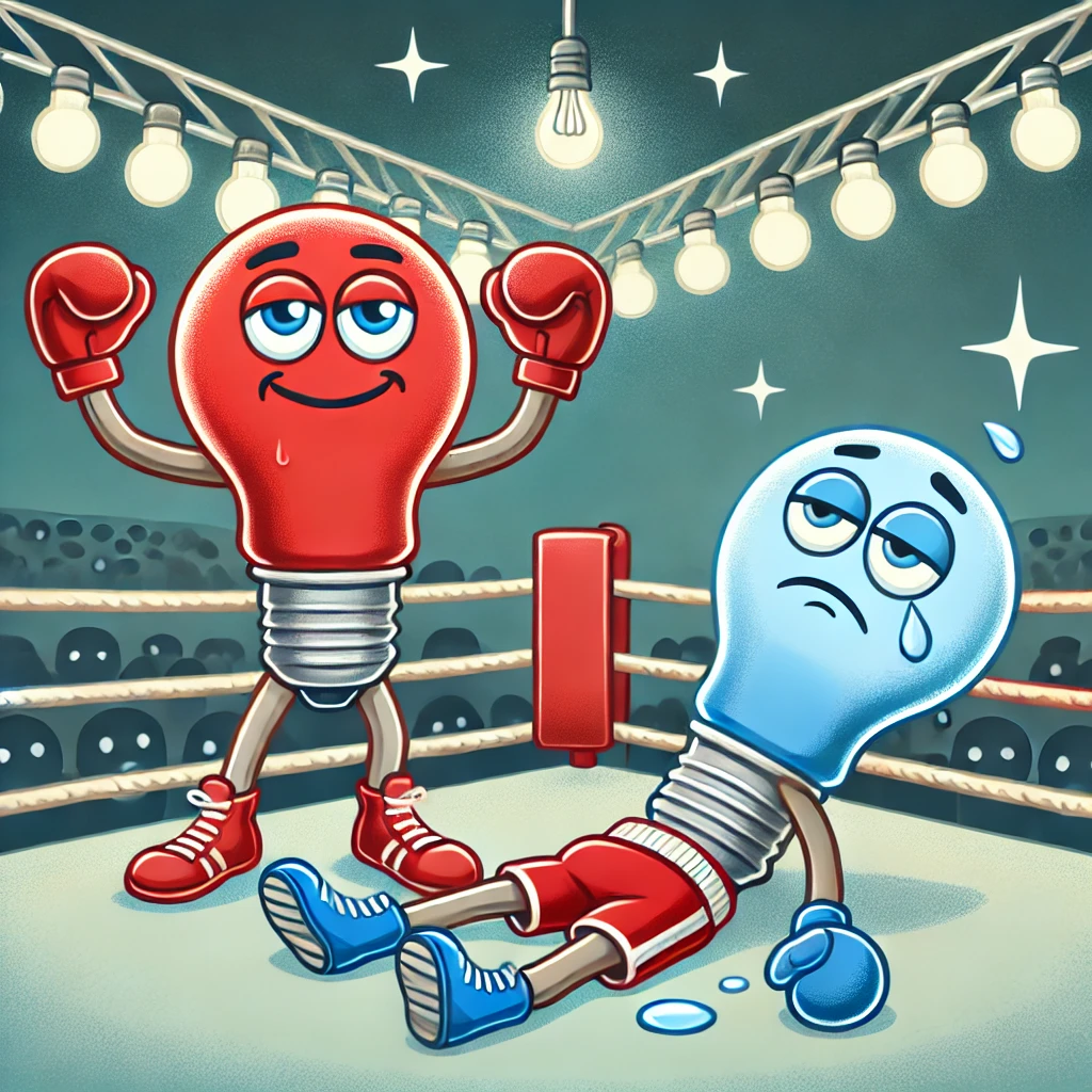
Measure for precise adjustment — 2–2.5 times is a starting point; it varies depending on the gel brand and shade:
When working with colored light, AWB may apply different corrections from frame to frame. For consistency, start with a fixed Kelvin value and shoot in RAW. There isn’t just one “correct” Kelvin value; I usually 5200 K (daylight) I’ll start with this—the starting point you choose within the 4300–5600 K range changes the warm-to-cool distribution of the color palette and shifts the gel’s result toward blue or yellow, allowing you to achieve different tones. The gray card is the most reliable method.
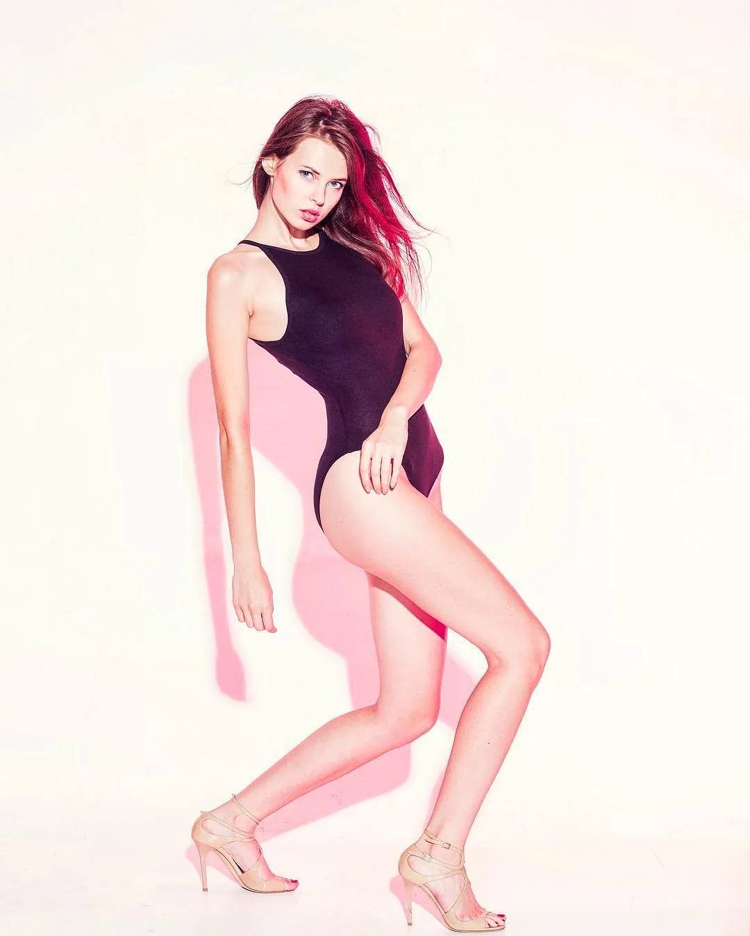
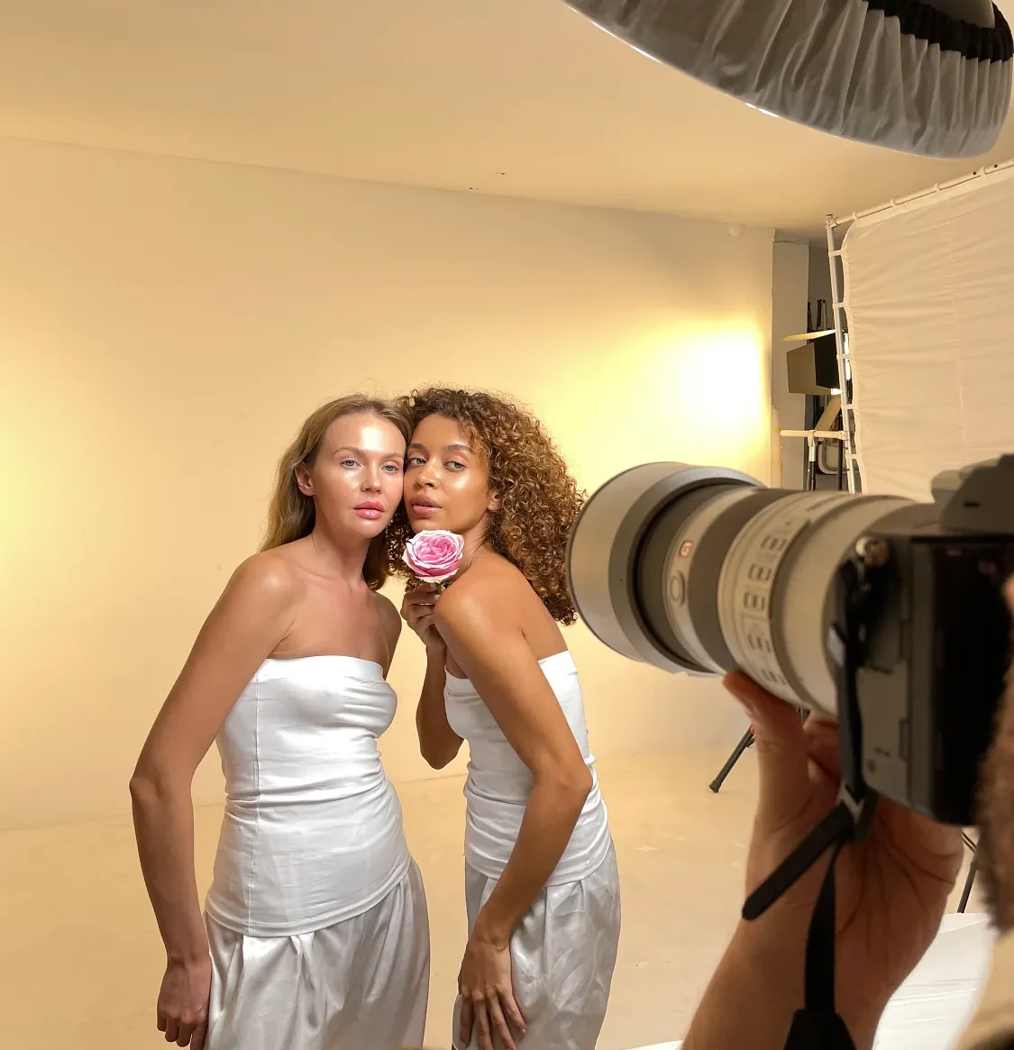
For portraits where you want the skin to look natural, leave part of the face in neutral white light, or use colored light only as an edge or background layer.
Use a heat-resistant professional filter or leave some space between the filter and the light; cut a ventilation hole in the cellophane.
Manually adjust the white balance; use a gray card if possible; reduce the ambient light exposure; and choose a light source with a high CRI.
Use a barndoor, grid, or black flag to direct the light to the target area.
Use a softbox or diffuser to soften the light.
Add a neutral, gelatin-free fill light to part of the skin, or move the colored light to the edge or background layer.
Use the histogram to balance the ISO–aperture–shutter speed triangle. In low light, focus manually or use an assist light to lock focus and then turn off the light.
The color wheel makes it easier to choose colors; however, a good color palette is determined by the subject matter, skin tone, brand identity, and the proportions within the frame.
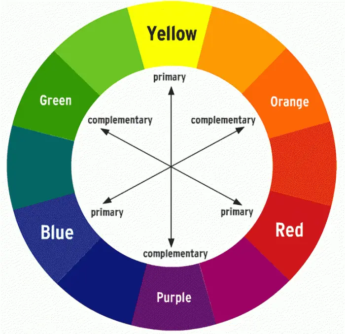
Different levels of brightness and saturation within a single color. It highlights form, texture, and shadow.
Adjacent colors on the color wheel. Soft, seamless transitions, such as blue–purple or yellow–orange.
Blue–orange, red–cyan, green–magenta. High contrast and a strong visual hierarchy.
A primary color and the two colors adjacent to its opposite. This provides a more flexible palette while maintaining contrast.
Effect: Energetic, modern, high-tech.
Usage: Fashion shoots, tech products, nightlife concepts.
Effect: A balance between calm and vibrancy — the cinematic “teal & orange” aesthetic.
Usage: Travel, adventure, portraits of heroes.
Effect: A blend of naturalness and creativity.
Usage: Artistic portraits, product photography featuring natural ingredients.
Effect: A mysterious, serene, dreamlike atmosphere.
Usage: Night shots, atmospheric portraits.
Effect: A warm, inviting, and welcoming feeling.
Usage: Food photography, family themed shoots.
Passion, energy, excitement, danger.
Recommendation: Key points to highlight, sales and promotional visuals.
Trust, loyalty, calmness, professionalism.
Recommendation: Corporate shoots, financial services, technology products.
Nature, freshness, growth, health.
Recommendation: Organic products, environmentally friendly projects, health sector.
Happiness, optimism, caution, warning.
Recommendation: Warning themes, children's products, energetic concepts.
Luxury, mystery, creativity, nobility.
Recommendation: Fashion and beauty photo shoots, premium products.
Color psychology is not absolute: “Pairings like ”blue always means trust, red always means passion” vary depending on culture, context, saturation, brightness, and the proportions in the image. Use color not as proof of the narrative, but as a design element that guides the narrative.
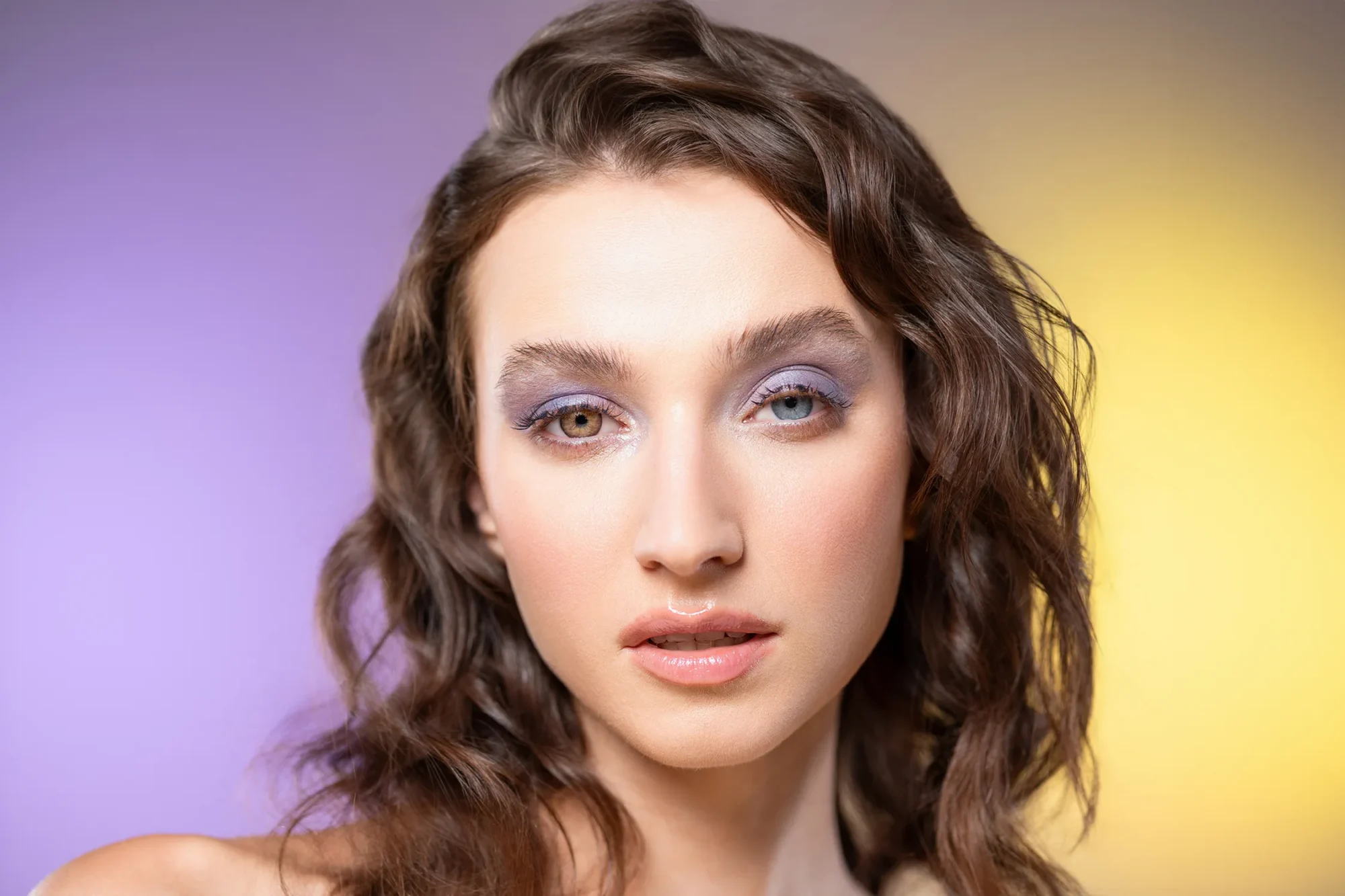
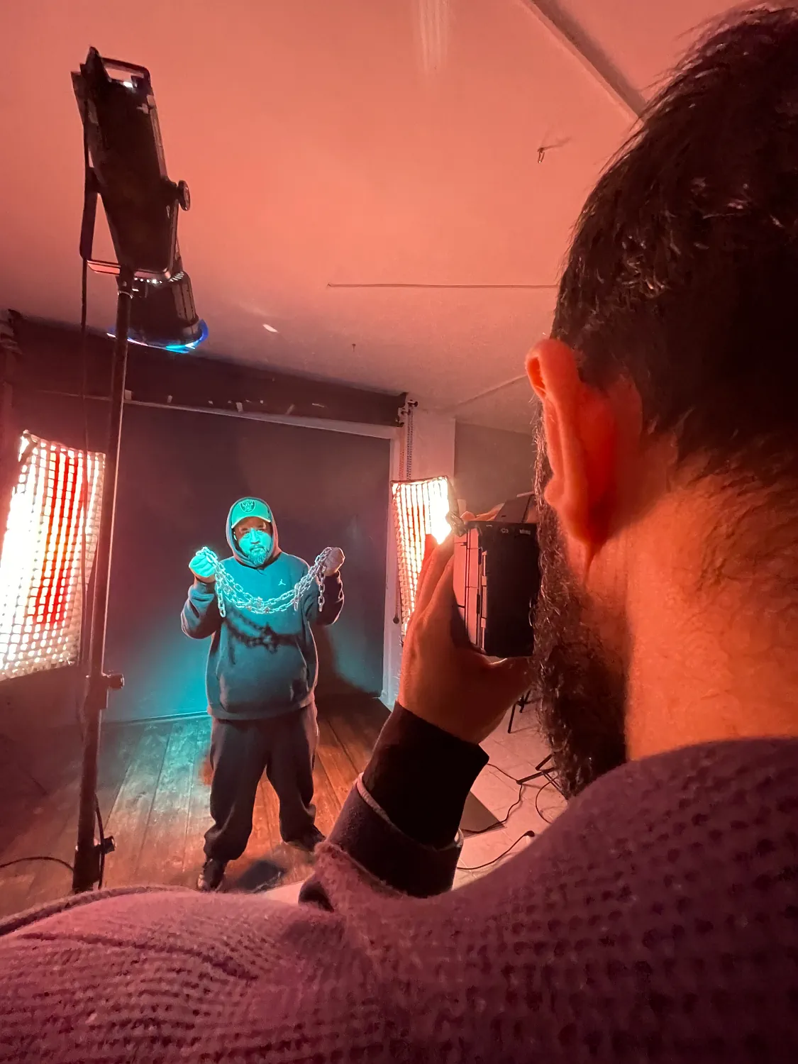
Red-orange tones convey warmth and intimacy; blue-green tones convey calm and serenity. Create a strong accent using high-contrast complementary pairs, such as red and green, for a dramatic effect.
When colored light hits the face directly, it alters the skin tone; this isn’t always a problem. However, in beauty and commercial portraiture, where the color of the product or makeup needs to be accurately rendered, separating the neutral main light from the colored edge or background light yields more controlled results.
| Purpose of the shoot | Starter Palette | Lighting Strategy | Checkpoint |
|---|---|---|---|
| Natural skin tones + colorful atmosphere | Neutral white + one accent color | Neutral key, colored rim, or background | Leave a neutral reference on the face |
| Neon Editorial Portrait | Magenta + cyan | Hard/medium-hard light from both sides | Manage color blending on the nose and cheeks |
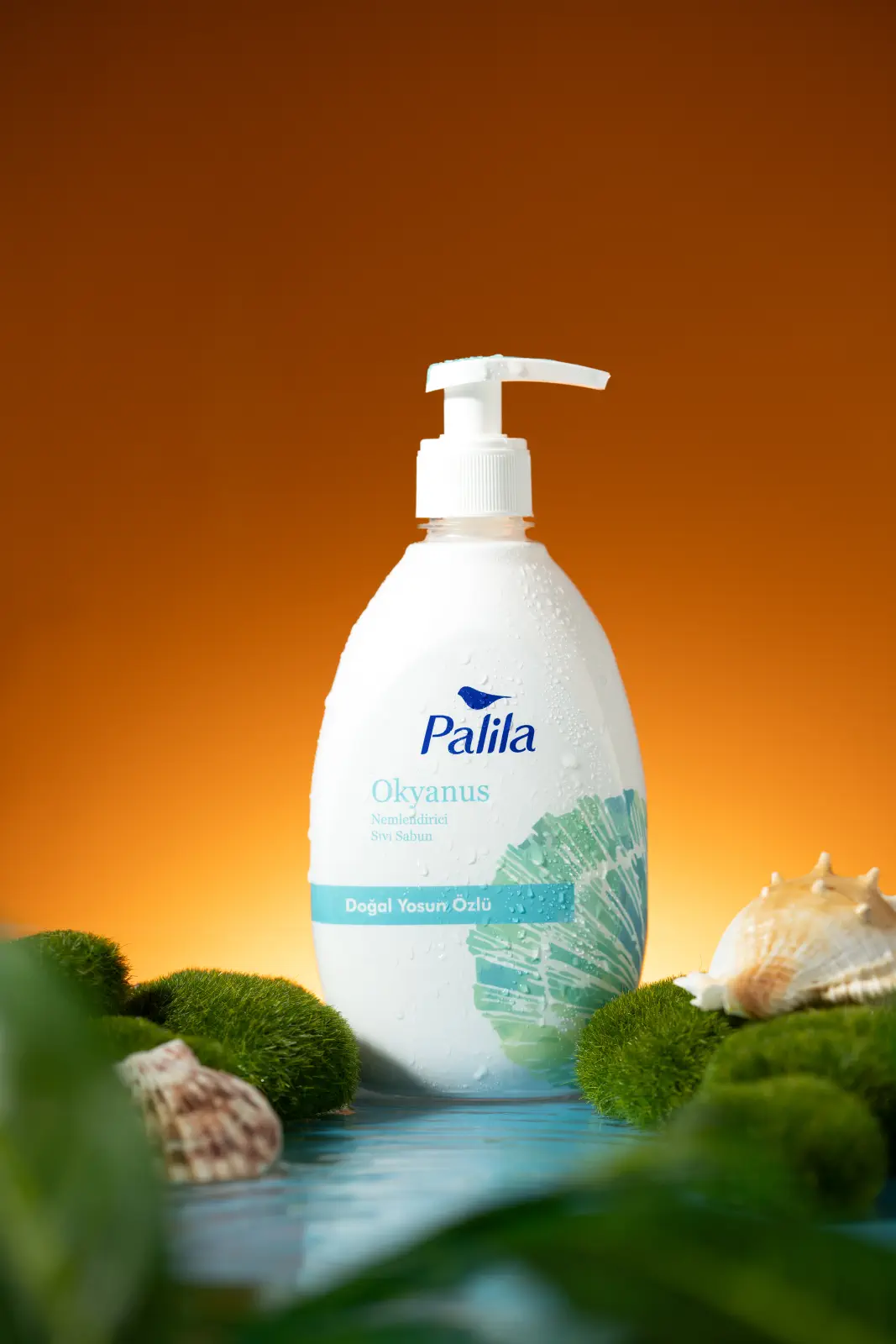
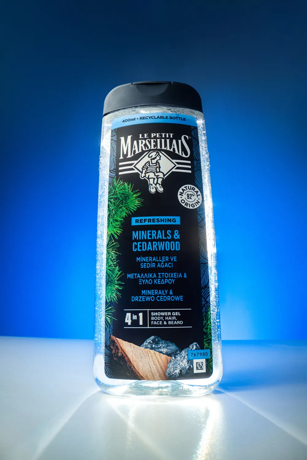
| Separating the product from the mold | A background that complements the product's color | Product: neutral, background color | Do not alter the color of the packaging |
| Brand Identity | Primary + secondary brand color | Distribute them across the background and decoration layers | Verify the corporate color code on the monitor |
Even if the overall brightness appears correct under colored light, a single RGB channel may reach saturation and lose detail.
In addition to the total histogram, evaluate the red, green, and blue channels separately. Single-channel clipping is particularly common with neon red and blue light.
With inexpensive LEDs, banding caused by PWM may occur in dimmer and effect modes. Test them using actual shooting conditions in photos and videos; do not rely solely on visual inspection.
White light quality CRI/TLCI of 95 or higher Aim for these metrics. These metrics alone do not fully explain the quality of the saturated RGB effect color; evaluate the spectrum, power, and camera test together.
The most common questions in the Quick App are about equipment, white balance, and the number of lights.
A single light can produce a monochromatic result. Two lights are sufficient to separate the main subject from the background or to illuminate two edges in different colors. A third neutral light makes it easier to control skin tone, especially in portraits; complex setups require four or more lights.
A basic DSLR or mirrorless camera or a smartphone, one or two light sources (a flash, LED, or powerful flashlight), colored gel or cellophane, and a tripod are all you need to get started.
An RGBW fixture features a true white LED channel in addition to the red, green, and blue channels. This channel produces a more accurate white that does not have a blue cast, resulting in more natural-looking skin tones; however, color accuracy depends on the device’s spectrum and calibration.
There is no single required value. Turn off auto white balance and select a fixed starting point—5200 K daylight is a good starting point for results close to what you see with your eyes—shoot in RAW, and maintain the same value throughout the entire series. Different Kelvin values give different effects by shifting the gel’s result toward blue or yellow.
It should be used only with heat-resistant professional filters and under the temperature and installation conditions specified by the manufacturer. Do not place cellophane in front of continuous high-intensity light sources; if you do, maintain a safe distance and ensure proper ventilation.
Ambient light may be washing out the color saturation; additionally, the light may be spreading too widely across the surface, or the white balance may be trying to neutralize the colors. Reduce the ambient light, shape the light, and use a fixed white balance.
Use this when you want to make the product stand out, during themed photo shoots, or when you want to highlight your brand colors. A background or lighting that complements the product’s color makes the product stand out clearly against the background.
Apply a gelatin-free, neutral fill light to part of the face or skin, or extend the colored light to the edge and background layers; make fine adjustments in post-production.
Depending on the power and battery capacity, it takes between about half an hour and three hours. For low-power models (30–60 W), the ability to charge using a power bank is a major advantage.
By using cookies, we can store and access device information to enhance your experience. Your consent allows us to process data such as browsing behavior or unique IDs on this site. Not consenting or withdrawing consent may affect certain features and functions.